Serving the culture. Building connection and recognition through bold visuals and thoughtful strategy
Sports, Non-profit, Community Group
Creative Director
Creative Direction, Photography, UX, Brand Design, Content Development, Brand & Marketing Strategy
June 2024 - August 2025 (website management concluded July 2025)
Figma, Photoshop, Lightroom Classic, Illustrator, Wix, Nikon D750

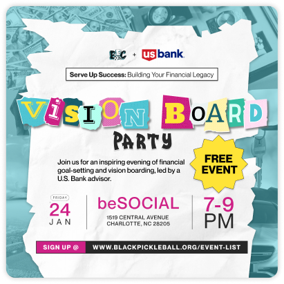
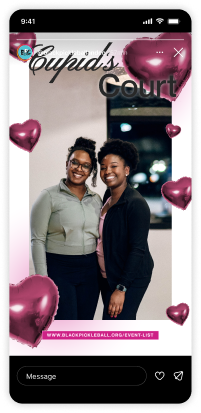
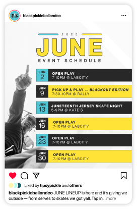
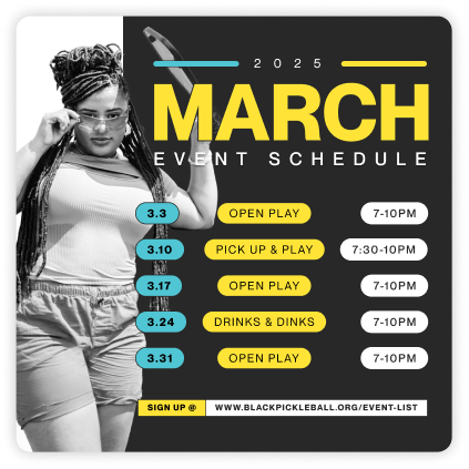
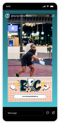
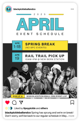
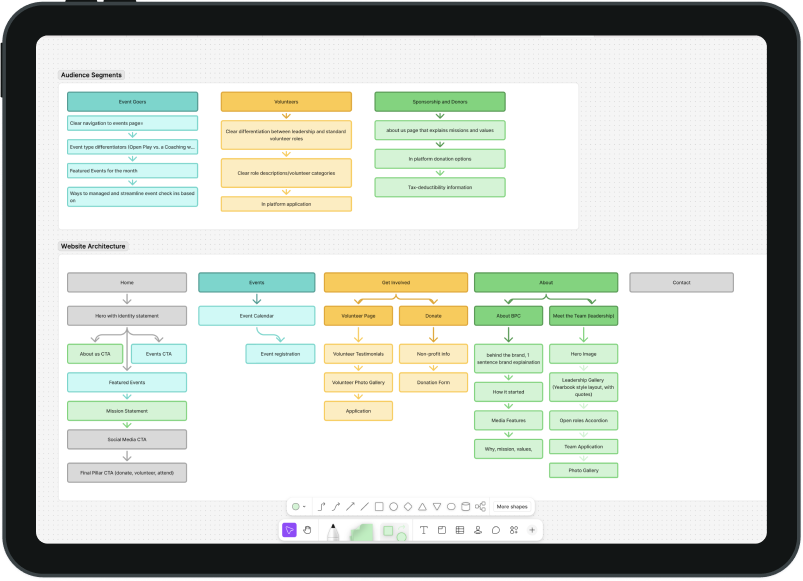
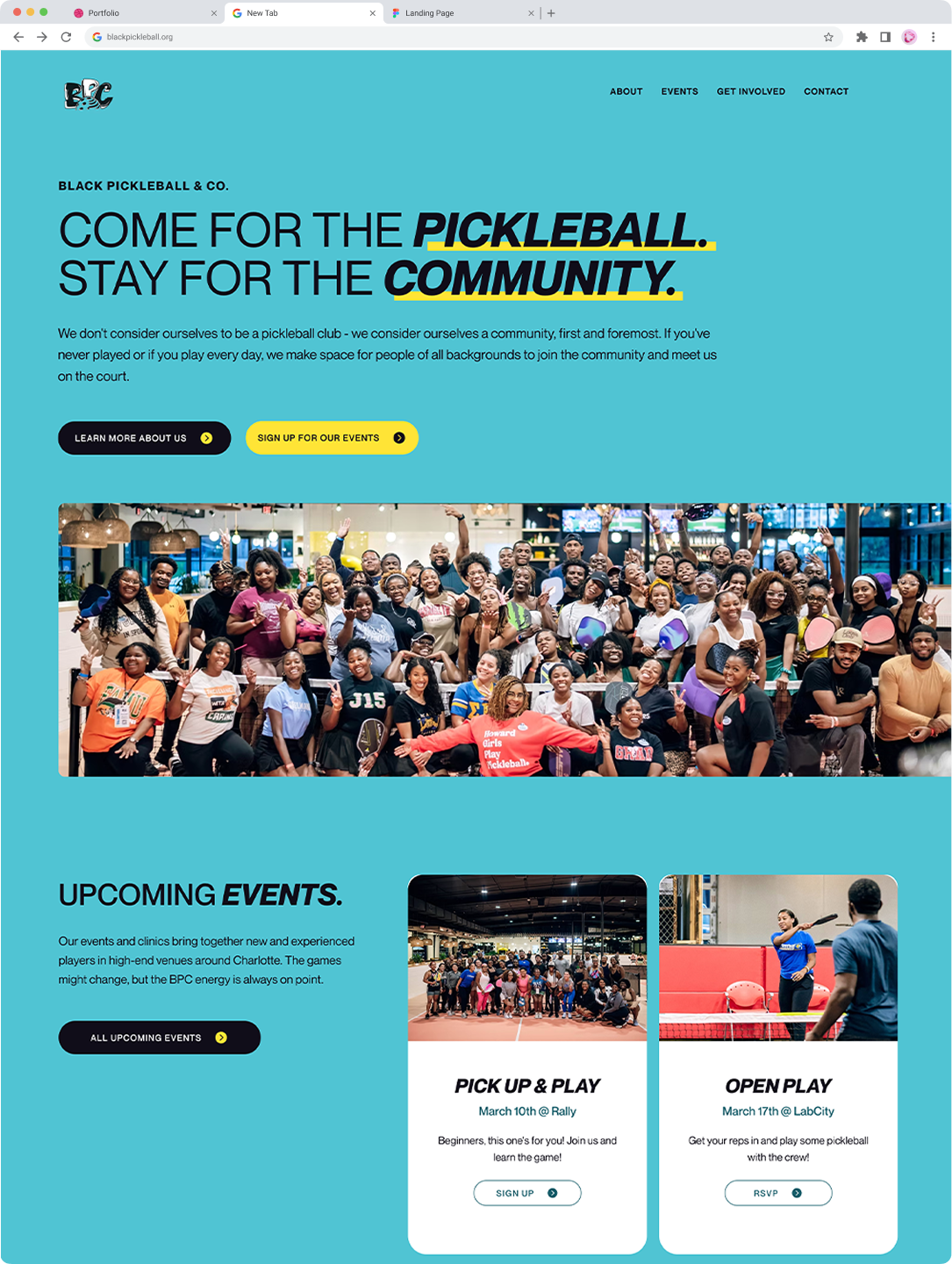
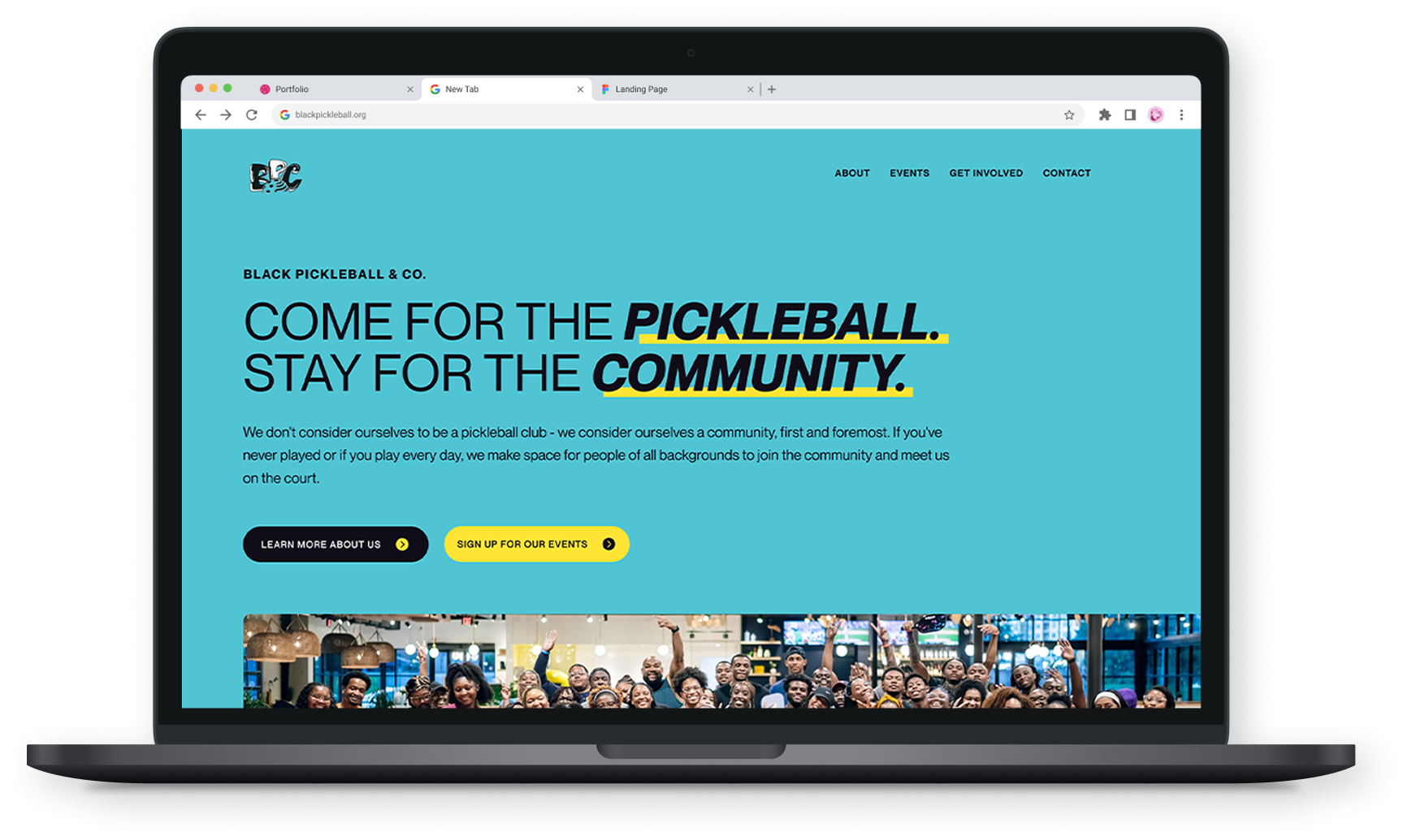
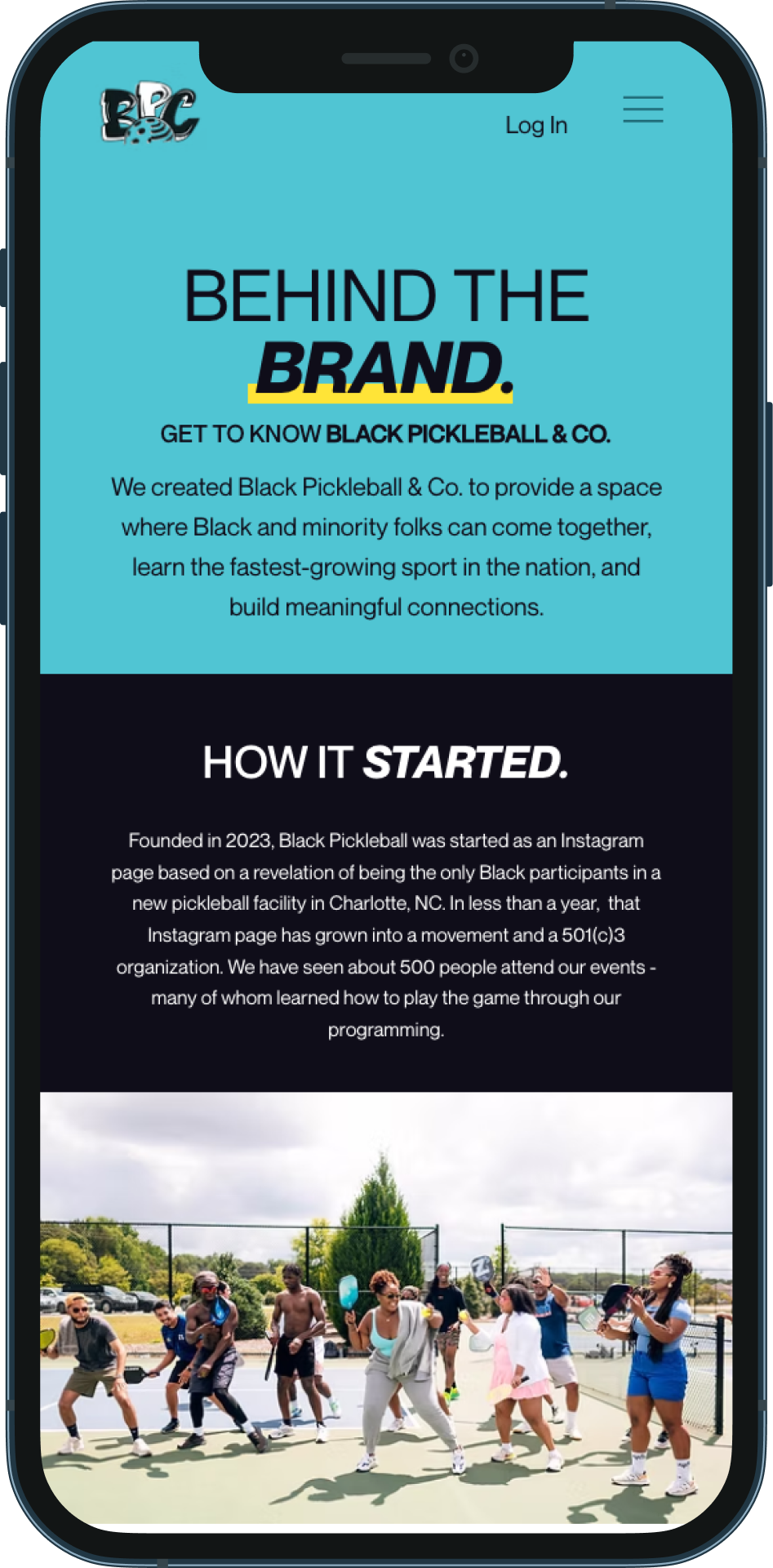
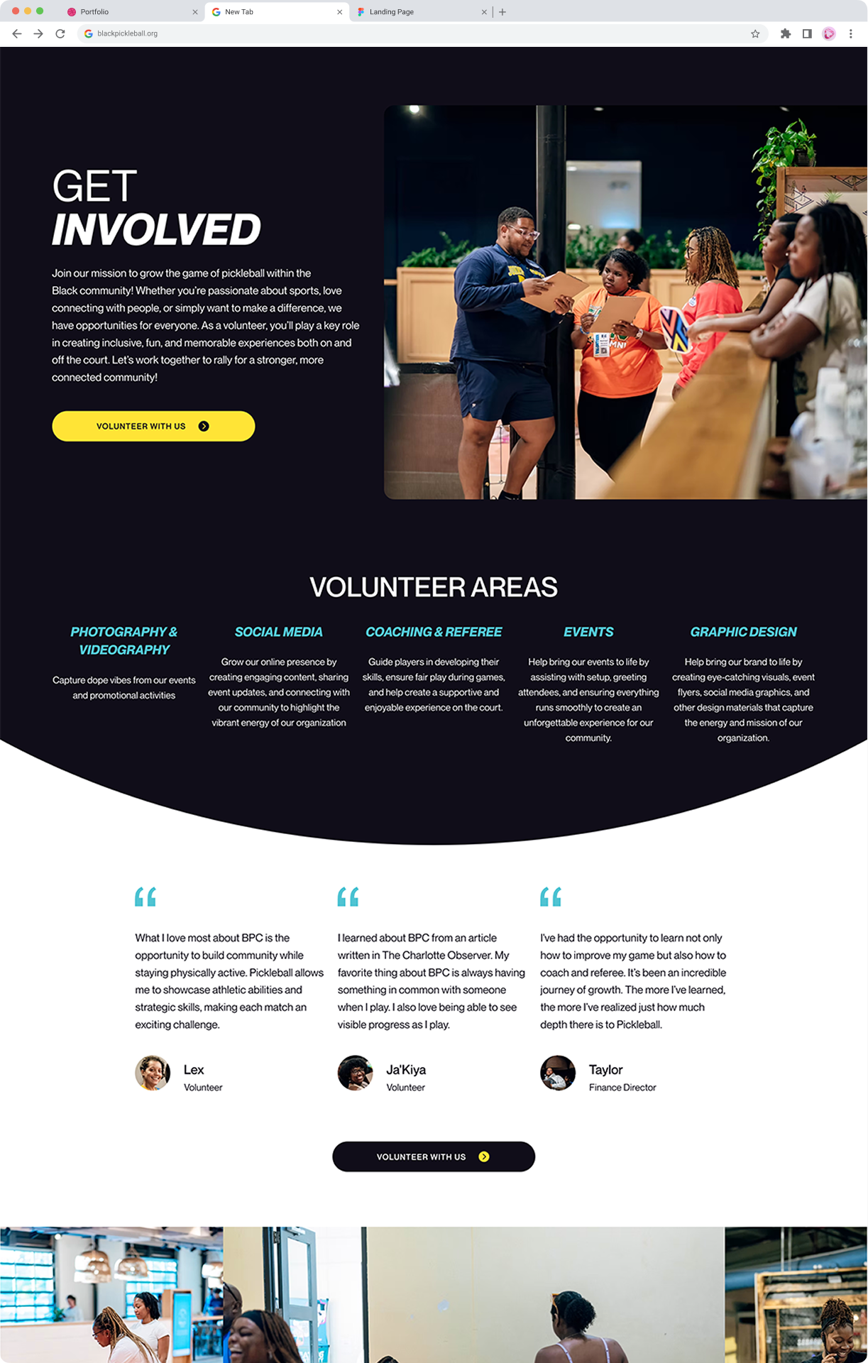
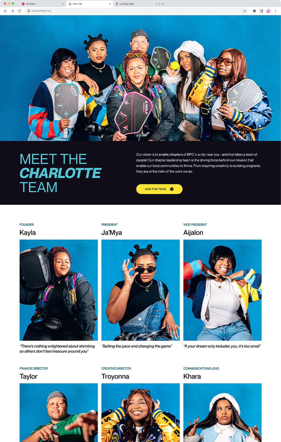
As Creative Director for Black Pickleball & Co., I have redefined the brand's visual identity to celebrate Black culture. My contributions include directing and development of the rebranded website, directing and photographing impactful campaigns, and managing the social media strategy to increase audience engagement. I’ve developed a cohesive brand presence that not only reflects BPC’s mission but also resonates with its growing community. My work has driven measurable results, including increased website sessions, increased ticket sales, a stronger digital presence, and enhanced brand recognition within the pickleball community. This portfolio showcases how strategic design, photography, and creative direction can come together to celebrate culture, redefine norms, and inspire connection.
Breaking away from the preppy, inflexible visuals often seen in pickleball, we instead crafted a bold, authentic identity that resonated with the culture. We aimed to make waves within the Charlotte community by creating visuals that feel fresh, relatable, and culturally connected. This approach not only engages viewers but also establishes a memorable brand presence. To create assets that spoke to the founder's mission, the following needed to occur:
The brand was shifted away from muted colors and country club crests, in favor of vibrant visuals and bold typography. This direction was rooted in the Founder’s vision to embrace the fun and individuality of Black culture. I refined the original identity, ensuring it was versatile and adaptable for diverse platforms, media, and ventures. To deepen cultural relevance, I drew inspiration from influential brands and media that resonate with Black communities, including Nike’s 90s campaigns, Blavity, Essence, and Culture Con. All entities that have contributed to impact within the culture. This research guided a strategy that aligned to BPC’s mission and vision
I developed a cohesive brand system for social media that extended the visual identity. This included layout styles, color usage, typography treatments, and content framing that allowed the team to communicate consistently while remaining flexible. The refreshed brand presence increased recognition and engagement, contributing to stronger attendance and ongoing community growth.
increase in social media engagement
followers gained on Instagram from January - April
As part of the creative direction for BPC, I developed an extended color palette to bring more versatility and depth to our brand visuals. This broader range of colors allows us to adapt our look across different platforms and campaigns while staying true to our identity. Just as importantly, the expanded palette was thoughtfully crafted with accessibility in mind, ensuring strong contrast for legibility and a more inclusive experience for all audiences.
The graffiti font previously chosen to use for headers was deprioritized and repositioned as a specialty accent within our identity due to its limited versatility and readability challenges at scale. Research shows that overly decorative fonts can reduce legibility and cause friction for users, especially across digital platforms. In response, I elevated our secondary font, Neue Montreal, to our primary typeface because it blends smoothly with our graphics, improves overall readability, and offers greater design flexibility. Supporting a more accessible, consistent, and collaborative visual experience, especially when partnering with other brands. Pinyon Script was added to our brand identity to bring more versatility and warmth to our typography, offering an elegant option for special moments or highlights; incorporating a script font also supports UX by adding visual hierarchy and personality, helping important text stand out without sacrificing clarity.
The new bold and vibrant brand identity was effective on social media, making our promotions stand out within the feed.


The site needed to serve multiple key functions—allowing users to find events, learn about the organization, apply to volunteer, and donate. Balancing these CTAs while maintaining an engaging and intuitive design was crucial for maximizing impact.
To better serve our community and support our business model, the website’s structure was thoughtfully reorganized around our three core audience groups: event attendees, potential partners/investors/donors, and volunteers eager to get involved.
Recognizing that our events generate essential revenue while also depending on donor support and volunteer participation, we implemented a dual call-to-action approach in the headers and top-level navigation to address both needs simultaneously. Leadership and volunteer applications were migrated from Google Forms to Wix, ensuring all insights and data remain connected in one platform for greater efficiency. Finally, the new extended color palette was applied with accessibility top of mind, making sure all CTAs and text meet ADA and WCAG standards for clear, inclusive user experiences.
increase in site sessions within the first 30 days of relaunch
increase in event ticket sales selling out at 35 tickets

The original BPC homepage felt cluttered and lacked clear pathways for different audience groups, making it harder for visitors to quickly find event details, volunteer opportunities, or ways to support the organization. The heavy use of the graffiti font made headers hard to read, and the single, generic call-to-action with basic forms created friction that didn’t align with UX best practices for clarity and user flow.
The redesigned homepage uses a clean, audience-focused layout with improved visual hierarchy and clear dual CTAs that guide attendees and supporters to the right next steps. The graffiti font was repositioned as an accent for special moments, improving readability, while an accessible color palette and integrated Wix forms make the site easier to navigate and more inclusive for all users.


BPC needed original, high-quality visuals to truly represent who we are as a brand: real people, real culture, and real stories. Stock images and generic pickleball photos didn’t align with their identity or connect with the community they served. I set out to create imagery that felt both authentic and fresh.
I planned, directed, and photographed both shoots, using the team and participants as subjects to maintain authenticity. The initial brand content shoot took inspiration from 90s urban fashion to create editorial-style images that felt bold and fresh. Inspired by the annual Freshman Class XXL campaign, the Yearbook Photoshoot was organized and focused: simple blue backdrops, streetwear that reflected each leader’s personality, and a relaxed atmosphere that really showcased who BPC was as a team. B-roll was also captured to extend the content’s use across social and year-end storytelling.
I created a strong library of versatile, on-brand imagery that feels true to our community and instantly recognizable. Using real collaborators built trust and a deeper connection with our audience, reinforcing that BPC is more than a brand. The photos continue to strengthen our brand recognition while putting real faces to the name, helping people feel more connected to our team and our mission. With the launch and behind-the-scenes content from the Yearbook Photoshoot, our post views increased by 29%, showing how authentic visuals can drive real engagement.


If you’re looking for a creative partner who can lead strategy and execution, Iet's connect.