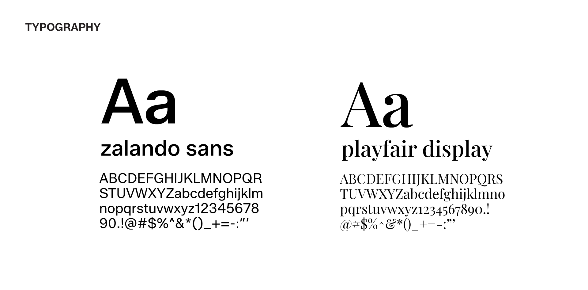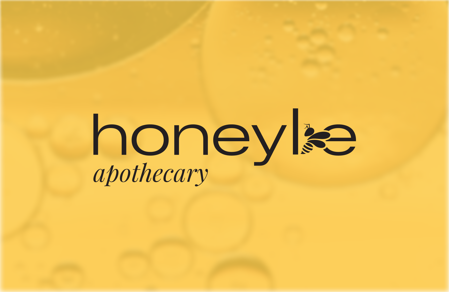
Brand identity development. A logo system, color palette, and brand guide that translate HoneyBe's quiet-luxury positioning into a consistent visual language across packaging and platforms.
DTC - Bath & Body, Wellness
Brand Designer & Strategist
Brand Design & Strategy, Visual Identity & Packaging Application
June 2026
Adobe Illustrator, Figma, Canva

HoneyBe Apothecary is a bath and body brand built for women who spend their days nurturing everyone else, soldiers stationed abroad, professors, teachers, nail techs, moms, and rarely pause to nurture themselves. Founder Brittny Coleman already knew what the brand needed to feel like: black, minimal, feminine, quiet luxury. The product itself delivered on that promise. What didn't yet match was everything around it: customers who received a HoneyBe product were consistently surprised by the quality, a sign the identity and packaging weren't yet doing their job. We ran a discovery process and a brand workshop to define HoneyBe's voice, audience, and visual direction, then built a logo and identity system through two concept rounds and a revision pass grounded in that research. The result is a mark and color story that reads calm and considered, so a customer knows what she's holding before she opens it.
HoneyBe Apothecary had a founder with a clear point of view and a product that already delivered, but no system yet built to carry either. To close that gap, the brand needed:
We started with a discovery questionnaire to capture Brittny's own language for the brand, its audience, and what "right" would look like at the end. From there, a live brand workshop covered brand adjectives, brand archetype, competitive landscape, and style direction across color, logo, packaging, and product. Caregiver emerged as the anchor archetype, with Creator and Lover close behind, the throughline for a brand built to give something back to women who give to everyone else.
This project centered on brand clarity and visual consistency rather than immediate performance metrics. Through a defined identity system and brand guide, HoneyBe Apothecary gained a consistent look across packaging and platforms and a clearer story to tell its audience. The identity gives the brand a foundation to launch new products and campaigns with a point of view that already feels finished, not built one post at a time.
Brand adjectives and keywords translate a founder's instinct into decisions a designer can act on without her in the room. The workshop ranked HoneyBe's direction into three groups: Personable, Trustworthy, and Authentic; Black, Quiet Luxury, and Feminine; High Quality, Sustainable, and Intentional. Those words, along with competitive and audience research, informed every visual decision that followed.


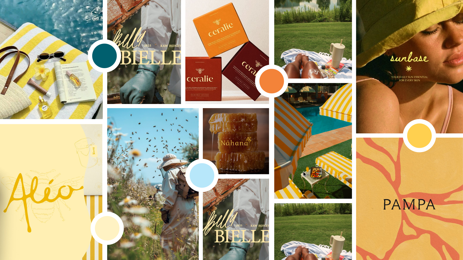
The workshop findings were clear: relaxation, self-care, refilling your own cup, needed to be prominent and present in the brand identity, not just implied by the product. Translating that into a visual world meant thinking about where that feeling actually lives, by a pool, at the beach, elevated with a touch of luxury, closer to a Martha's Vineyard trip than a spa day. That combination, bright, beach-inspired color grounded in something more considered, became the moodboard's throughline and the shared reference point for everything that followed: the color story, the mark, and how the brand should feel once it's in someone's hands.
The palette pulls directly from that pool-and-coastline reference: a golden yellow anchor, warm terracotta, a deep teal, a soft sky blue, and cream. It reads as bright and beach-inspired without losing the quiet luxury the brand adjectives called for.

Two concepts moved forward from the workshop findings, each explored as a wordmark-first and a mark-first direction.
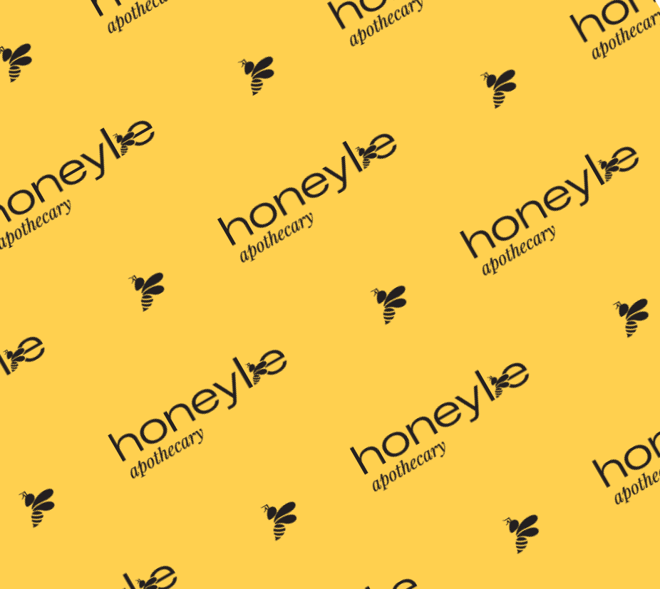
Both concepts were tested directly on sample labels, including a Golden Body Oil in a Pistachio Gelato scent, so we could evaluate the mark in context rather than in isolation. A revision round refined the strongest elements into the final system: a mixed serif "honeybe apothecary" lockup paired with a bee complimenting the curve of its own letter. The "hb" icon natbuilt to work together as a full lockup or apart depending on where they land.
The finished identity gives HoneyBe a full logo suite, stacked, horizontal, two-color, black and white, and icon-only, plus a one-page brand guide and a packaging label template, so the brand can apply itself consistently without re-solving the system for every new product.


If you’re looking for a creative partner who can lead strategy and execution, Iet's connect.