Brand evolution. Establishing industry expertise through thoughtful visual strategy and design.
Technology, Cloud Services, B2B
UX and Brand Designer
Brand Design & Strategy, UX Design
October 2023 - April 2024 (website management concluded April 2024)
Figma, InDesign, Hubspot

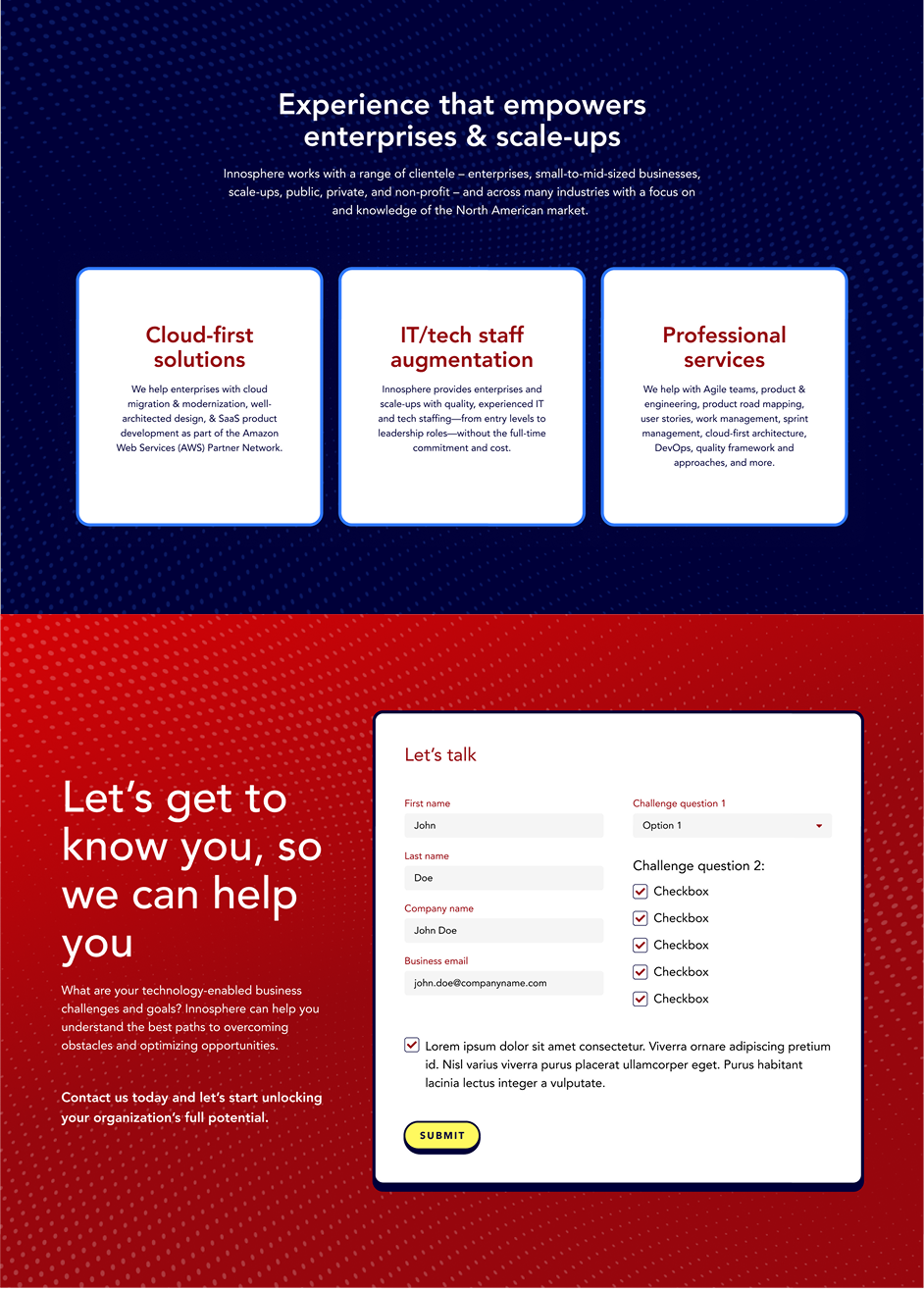
Innosphere, a B2B tech solutions company, uses cloud-first services to optimize enterprises and scale up businesses. Their brand lacked clarity with fonts pairings and color choices being inconsistent between platforms. They aimed to establish a natural and refreshing brand evolution that felt relatable and approachable to their audience. Simultaneously conveying that they are industry leaders who solve real problems for their customers. We found ways to introduce a new color palette and visual styles that made Innosphere unique in its market. These changes impacted and increased their brand awareness and created a cohesive identity across platforms.
Innosphere lacked a distinct identity within its market. Their previous brand was outdated, lacked a diverse and accessible color palette, and did not resonate with their target audience. In addition to this, conversion rates suffered from a lackluster website that had no storytelling built into its structure. To solve for this, Innosphere needed the following:
To address their visual challenges, I conducted thorough competitor research and a brand workshop with stakeholders to refine their visual identity. This workshop included choosing adjectives that defined their brand, determining a brand archetype that set the foundation for their messaging, and identifying styles that reflected our new findings.
This project centered on brand clarity and narrative alignment rather than immediate performance metrics. Through updated design systems and a refined website experience, Innosphere gained a stronger visual identity and a clearer story for prospective partners and audiences. The refreshed visual system and website established a clearer narrative around who Innosphere is, what they do, and the value they provide.
The updated site improved content hierarchy, visual consistency, and overall storytelling, making the brand feel more cohesive, credible, and prepared for future growth. These changes positioned Innosphere to launch campaigns and partnerships with stronger alignment and clarity.
Brand adjectives and keywords can help us understand stakeholder expectations and build brand awareness. In our workshop, we placed a list of descriptors in front of the stakeholders and ranked them per category. The top 3-4 words in each section, along with our competitor and market research, informed our other design decisions when thinking of characteristics of the company. Through this exercise, I was able to hear their perspective on the business and how it shows up for their clients: they are experts who solve real problems for their customers.
Brand archetypes help determine which human characteristics best represent the brand. Through strong emotional connections, the brand can form deeper connections with a target audience. Based on research, keywords, and conversations with stakeholders, we determined the that their brand archetypes were the following:
Sage — represents trust, knowledge, and guidance. Educating their customers through solutions and not just selling a product.
Hero — represents mastery, expertise, reliability. Solving major problems for their customers building trust and confidence.
Caregiver — represents help, empathy, and security. Driven to provide reliable service, advocating for clients and the solutions that work best for their operations.
Innosphere’s new color palette stays true to brand aspirations, but evolves slightly to address ADA Compliance concerns with contrast. Overall, this color palette shows impact, mastery, and is engaging to users. The color blue is used heavily within the tech industry, and using red in combination is a differentiator amongst Innosphere’s competitors. This combination of colors also pays homage to comic book superheroes, another connection to their brand archetype foundation. It is a palette that provides variety, vibrancy, and contrast.
The Innosphere website was often the drop off point for potential conversions. With a confusing user journey and one-dimensional visuals, qualified leads did not feel inclined to move forward. The site needed the following:
Working with our content writer and web project manager, we were able to create a page architecture that guided potential partners through our desired conversion path. Prioritizing audience identification and pain points.
I introduced a unique comic/illustrative style, humanizing the brand while adhering to their request to avoid stiff stock photography and remain authentic. Our web developer was also able to add scroll animation to the new icons to make them appear a bit more playful/interactive. The use of organic shapes and alternating between 2D and 3D styling showcases the flexibility within the brand.
The updated site improved content hierarchy, visual consistency, and overall storytelling, making the brand feel more cohesive, credible, and prepared for future growth. These changes positioned Innosphere to launch campaigns and partnerships with stronger alignment and clarity.


If you’re looking for a creative partner who can lead strategy and execution, Iet's connect.